Minitable
Minitable is a light weighted restaurant SaaS platform
It provides technology-based solutions for restaurants, including waitlist, reservation, digital menu, online ordering, business management, marketing management, and more.
I joined the company as a Product Designer/ Manager, and was in charge of the revamp for their online ordering website, used by restaurants across the US.
Project type: Full-time
Duration: 2022.5 - 6
Tool: Sketch
Role: Product Design/ Product Management/ Visual Design

Brand · UIUX · Product Management

The Challenge
The company already has a working website for online ordering services. However, it has poor UIUX and visual design.
I was given the task to do a comprehensive audit of the site's design, from both the visual and experience perspective. Then I proceeded to do a complete revamp of the site for an elevated aesthetic and improved user experience.
Old Website Screenshots


My Solution
I started by spotting the outstanding problems of their old website:
-
Layout problems: texts didn't display well because of their placement on top of an image; alignment of elements on the page is not consistent, with some centered and others aligned left; picture, which is not important, takes up a huge space on the page.
-
Text style problems: texts were too small and light-colored for legibility; line spacings were narrow so users couldn't click easily; there wasn't a clear and consistent text style guide to highlight hierarchy and pattern.
-
UIUX design failures: there were several places where a button is blocked by other elements; some features were not intuitive to use or effective; there was much unnecessary and redundant information displayed; visual hierarchy was lacking so users couldn't find the most important info or button quickly, and business can't draw attention to the CTA they value the most.
Brand Direction


Main Menu Page:
I rearranged the layout to ensure all important information is displayed clearly: improved visual hierarchy, more contrast on text and buttons, and smoother UX.
And as per our clients' request, I added a couple of new features to the main menu page: pickup policy, dining option selection, and zip-code check UX improvement.
I also redesigned the cards component and buttons on this page.


Item Detail Page
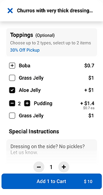
The biggest problem of the old design was its lack of design thinking and UX considerations. The user-flow was not clear and users complained about the difficulties when they tried to navigate and click on buttons.
So I tackled the problem by optimizing layout, getting rid of unnecessary informations, and adding helpful UI to the page.


Checkout Page
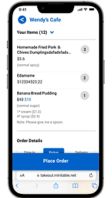
By reorganizing the UX structure of the checkout page, I transformed the user experience, making it an intuitive step-by-step process.


Track Order/ Receipt Page
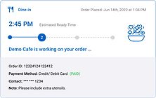
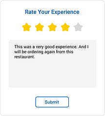
I evolved the order status tracking UI, by adding lively illustrations and text descriptions that correspond to different status.


